updated
Painting 1
 |
| Before Photoshop |
 |
| After Photoshop (to print) |
Print Screens and Tools Used

1. Palette Knife Effect to the Picture

2. Erase unwanted areas from the drawing with eraser tool

3. put layer 1 (picture) infront of the drawing and blend with Linear Light and finally erase the area girl and blood splatter
Elements of Design
Line: the picture consist lines.
Shape: Curvy and straight line shape.
Value: colours are used in a predictable sense.
Colour: Mixture of dark and light colours is used.
Texture: Matte
Alignment and proportion: the picture has more of a centre alignment and the objects are well proportioned.
Eye Movement: no eye movement is shown in the picture.
Eye Movement: no eye movement is shown in the picture.
Principle of Design
Hierarchy: the picture conveys the message of the consequence of using phone while driving.
Hierarchy: the picture conveys the message of the consequence of using phone while driving.
Balance: symmetrical balance
Proximity: close connection seen.
Repetition: there are repetitions seen in the picture.
Scale: the picture is well proportional, the objects in the picture has connections with each other.
Unity: the drawing shows the impact of using phone while driving, though some changes can make it stronger.
Repetition: there are repetitions seen in the picture.
Scale: the picture is well proportional, the objects in the picture has connections with each other.
Unity: the drawing shows the impact of using phone while driving, though some changes can make it stronger.
Colour Theory: Colour theory analysis: as the light theory of colour say the picture has less black and more of light colours. The picture has a colour scheme of nature, as well as colour context. The picture consists of
traditional colour system, with red yellow blue, green. For the value of the drawing, the red colour of the blood drop gives more emphasis. Red being the colour of blood, and has a strong symbolism as life and strength. It brings attention to the essence of life and living with importance on survival.
Painting 2
 |
| Before Photoshop |
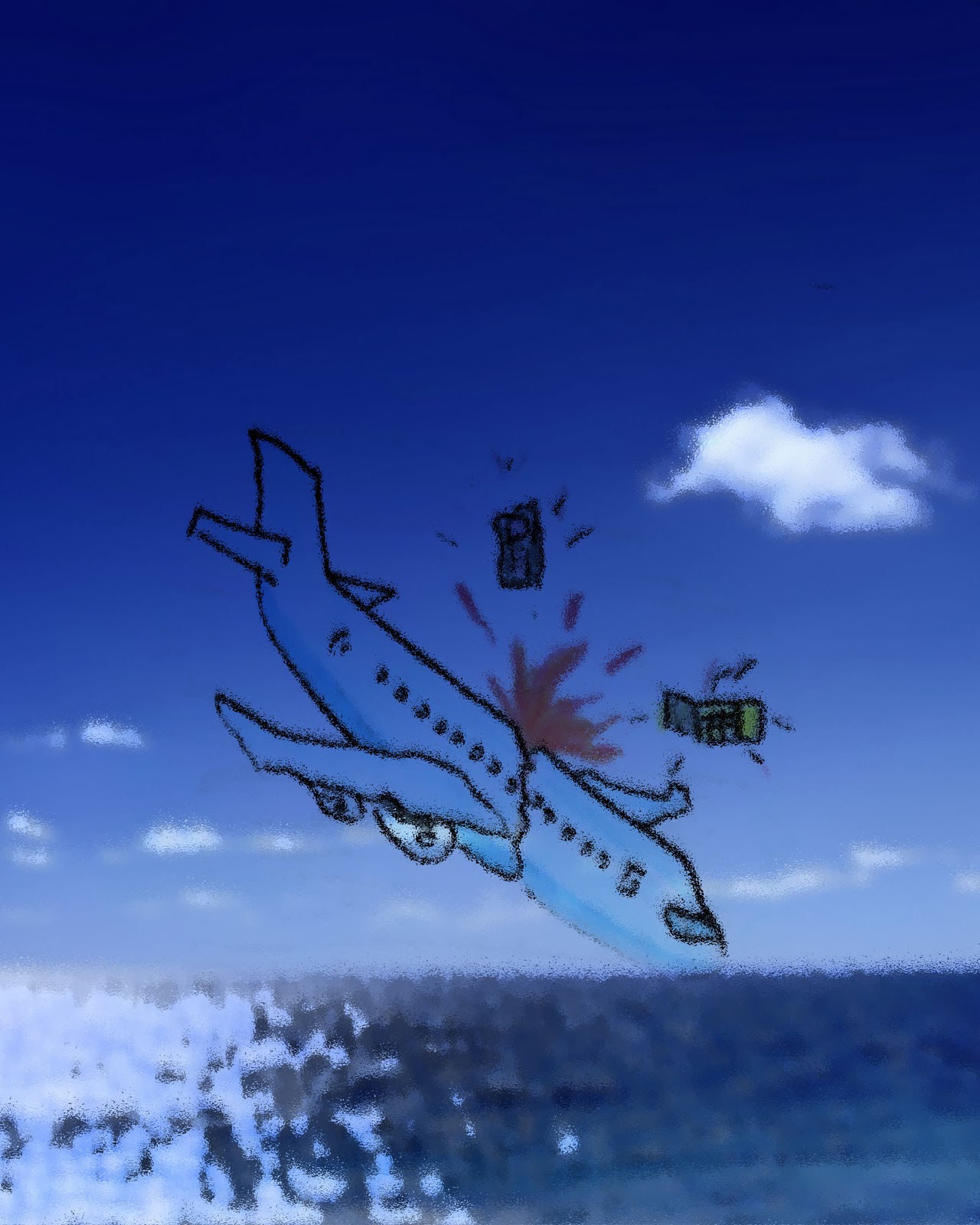 |
| After Photoshop |
Print screen and tools used...


2- blend the layer with aeroplane with Multiply

3- flatten all three images

4-Ocean Ripple Effect to the flatten Image
Line: the picture consist lines.
Shape: Curvy and straight line shape.
Value: colours are used in a predictable sense.
Colour: natural and context colour scheme
Texture: Matte
Alignment and proportion: the picture has a centred alignment, and has a good proportion of the objects.
Eye Movement: the picture doesn’t have any eye movement element.
Principle of Design
Balance: symmetrical balance
Principle of Design
Balance: symmetrical balance
Proximity: close connection seen.
Repetition: there are repetitions seen in the picture.
Scale: the picture is well proportional, the objects in the picture has connections with each other.
Unity: the use of colour and the elements shows a sense of unity.
Repetition: there are repetitions seen in the picture.
Scale: the picture is well proportional, the objects in the picture has connections with each other.
Unity: the use of colour and the elements shows a sense of unity.
Colour theory analysis: as the light theory of colour say the picture has less black and more of light colours. The picture has a colour scheme of nature, as well as colour context. The picture consists of traditional colour system, with red yellow blue and blue being dominant. For the value of the drawing, the blue colour of the ocean and sky as well as the plane gives emphasis to the symbol of communication as well as protection. Blue also gives a feeling of distance, and the red fire is associated with fiery heat, and danger.
Painting 3
 |
| Before Photoshop |
 |
| After Photoshop |
Print Screens and Tools Used


2-Image,adjustments,Levels and adjust for the desired outcome.. (in this case 102-1.00-255)
Elements of Design
Line: the picture consist lines.
Line: the picture consist lines.
Shape: Curvy and straight line shape.
Value: colours are used in a conventional sense.
Colour: natural colour scheme
Texture: Smooth
Alignment and proportion: the picture has a centred alignment, and has a good proportion of the objects.
Eye Movement: the picture doesn’t have any eye movement element.
Principle of Design
Hierarchy: the picture conveys the message of the importance of no phone zone to relax and enjoy family time.
Principle of Design
Hierarchy: the picture conveys the message of the importance of no phone zone to relax and enjoy family time.
Balance: symmetrical balance
Proximity: close connection seen.
Repetition: there are repetitions seen in the picture.
Scale: the picture is well proportional, the objects in the picture has connections with each other.
Unity: the drawing creates a feeling of peace and quietness, the dominance of blue colour sense unity.
Repetition: there are repetitions seen in the picture.
Scale: the picture is well proportional, the objects in the picture has connections with each other.
Unity: the drawing creates a feeling of peace and quietness, the dominance of blue colour sense unity.
Colour theory: as the light theory of colour say the picture has less black and more of light colours. The picture has a colour scheme of nature, with green, yellow and blue. The picture consists of mixture of CMYK and RGB colour system, blue being dominant. For the value of the drawing, the blue colour of the ocean and sky as well as the bubble gives emphasis to the symbol of youth, communication as well as protection. Blue also gives a feeling of distance.
No comments:
Post a Comment